After the Vote: The Massachusetts Bottle Bill

By Stephanie Simon, Yuting Yan, and Weiwen Zhao

Everyone by now is aware that the expansion of the Massachusetts Bottle Bill didn’t pass in the November election. And like with all things, there are two sides to every story. The Vote Yes on 2 Campaign blames the lack of funding for their loss, and the Vote No on 2 Campaign says their win was a demonstration of voters’ choice.

“The Bottle Bill would have added $68 million a year to the cost of groceries and there would’ve been a tremendous overhead cost on grocers that would have trickled down to the consumers,” said Nicole Giambusso, spokesperson for No On Question 2.

Giambusso listed this statistics as one of the many reasons voters decided to turn down the proposed addition of water, ice tea, and sport drink bottles to the already existing bill.

Andrew Fish, the Program Associate at MASSPIRG and campaign organizer for Yes on 2, says that the $68 million dollar grocery cost claim is simply not true.

“What we know for sure, and this is based on the Department of Environment Protection Studies, communities would have saved up to $7 million in disposal and liter clean up costs,” said Fish.

Fish says he believes the reason the No Campaign was successful was due to the massive funding from big bottle companies.

“Bottle companies did contribute to our campaign,” said Giambusso. “Every penny in and out was exposed publicly and can be found on our website.”

While you can easily find the list of campaign contributors, Katya Johns, the digital marketing strategist for Vote Yes On 2 said that these big bottle companies came out with big donations (No Campaign had $9 million in funding) because they were set to lose money if the bill was expanded.

“Bottle companies believed that a five cent increase on every bottle sold would reduce sales. It’s a false fact because other states where the bill is already implemented haven’t suffered any sale reductions,” said Johns. “Also the companies pay to take the bottles to the dispensers so with the bottles being more expensive and the potential decline of sales they feared losing money.”

Giambusso claimed however that the No side’s intentions were to focus on the environment saying that the Bottle Bill would only have increased recycling by 1/8 percent and would’ve cost a lot without doing much.

Claims like Giambusso’s were wrong and during the election the Boston Globe started endorsing the Yes Campaign because of it. The No Campaign said that 90 percent of Massachusetts had curbside recycling when really it’s only 64 percent.

“When it comes down to it I don’t understand what they had to gain,” Johns said. “Their potential losses didn’t justify all that spending. They seemed to be misinformed.”

Fish’s team is currently looking at options to keep pushing for an updated bottle bill, but there is no specific proposal at this time. Fish says their loss in November was because the campaign couldn’t match the No Campaign’s funding dollar for dollar.

“The vote on the Bottle Bill shows that if you yell something loud enough people start to believe you,” Fish said.
Is Huff Post’s Video Strategy Good Enough or Not?

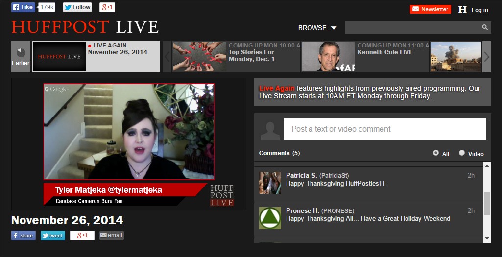
When thinking about the connection between Huffington Post and video, the first thing comes into my mind is the HuffPost Live, which is its live online news platform.

November 26, 2014 - Google Chrome

On the website, it has both the real-time video playing and the real-time comments as the right-hand sidebar, which allows audiences to post both text and video comments. The past videos are also classifies into different categories, such as “On the Couch”, “Latest on Worldbrief”, and “Healthy Living”. In terms of the percentage every section takes, the HuffPost live is more inclined to the lifestyle information, comparing to its text news website. This live site shows the social media to the audience very clearly, just as what its text news website does. However, the totally black background and harsh website design make the live site less than a serious and professional live news platform created by a big online news outlets which should have done a better job on the design part.

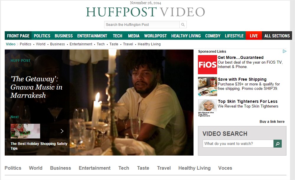
As to the text news website, it also has a video section called HuffPost Video. It includes a large number of videos from different fields, from politics, business, to entertainment, technology and health living. These videos are more related to the news. Comparing to the HuffPost Live, it also has a better website design, though the sidebar became sponsor ads just as the one appearing along with every text news article.

Videos and News on The Huffington Post - Google Chrome

However, based on what I have watched and browsed, all the videos are from other websites, some news websites as Reuters, Associated Press, and BBC news, or some other tech or business news website. There is no HuffPost original videos, comparing to its Live website.

Another thing which may be not be taken into account of their video strategy is how the website users can get to the videos, because there is no individual section tag as other news sections on the navigation bar.

Breaking News and Opinion on The Huffington Post - Google ChromeThe only access I found on the front page to the video is a small video tag after the headline of a story.

Breaking News and Opinion on The Huffington Post - Google Chrome_2

I think HuffPost Live is a good idea, but how to define this live news platform may be a question. Should it be more lifestyle or be more newsworthy? Do the users of the text news website like the live content? Or is the website trying to develop a different group of the audiences? As far as I see, the two website don’t have a close connection with each other.

What’s Election Night about? Data!

To cover the Election Night is to cover the data and story behind it.

As a quality coverage of politics on election night, it should at least sync report and update voting results real time, no matter whether it’s online or TV coverage. According to Columbia Journalism Review, the Daily Beast is a good example, of which the “top banner includes a countdown of the states and electoral votes yet to be called by major new organizations.” To use a map with the real-time data as a whole image is also a good choice to attract the readers and help them understand what’s going on right now without any compound analysis. Thus, a good job on the data visualization, such as the map and various charts based on the categories could help make the coverage in depth and complete.

When the website or the TV station has done a good job on showing and updating the data correctly (one scene in the Newsroom just came into my mind that the newsroom got the state abbreviation wrong), the next step should be a in-depth analysis about what’s going on now, as well as the profile and previous statement of the candidates. This step requires a large amount of preparation and information accumulation. Just as mentioned in Eleven Recommendations for Improving Election Night Television on Shorenstein Center’s website, though today’s evening newscasts have become more anchor-centered, to do the Election Night telecasts need more support from the experienced reporters to show what’s happening and what can be expected. I think, to choose the right person is also a key point to win the telecast war at that night.

When it comes to the exit poll, I think social media has a huge advantage against the traditional media, because of the real-time interaction with readers. Those mainstream media could do a small-range survey as the real-time exit poll when publishing the results. They could ask the readers to leave comments or answer several questions after they logged in with their age and state. Though this way lacks verification and maybe misleading the public, it could be interested to see something generated by the media itself based on its own readership.

However, there are something that a good journalist should avoid when covering the big day.

As mentioned in a Poynter Institute’s post, in the social media, professional news website’s account should offer verification, just as their role in the accident coverage. Though to publish the exclusive news at once is important, make sure that they are not falling for fake or anonymous accounts should be the very first thing to check. Then, don’t spread fake photos or any other fake information.

Though social media is powerful and informative, don’t draw conclusions just based on what shown on social networks.

For coverages on all kinds of platforms, because the team has been prepared for the election day for a long time, it could be easy to use the storyline. However, the Eleven Recommendations said that a storyline may show an inference of reason that someone wins or losses the election, which may not be true. Such storylines can get embedded in the nights commentary adn mislead or confuse viewers. Besides, it said “Journalists should also avoid words that send potentially misleading signals that might influence viewers who have not yet voted.”

A Quick Glimpse to the HuffPo’s Web Design and Content

The front page story of Monday’s HuffPo is about Ebola, which is an AP story of a Spanish nurse first to contract Ebola outside West Africa.

Breaking News and Opinion on The Huffington Post - Google Chrome

Photo from Huffington Post

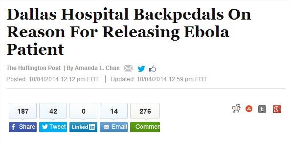
The Ebola stories have been appearing on the first page of the HuffPo website for couple of days. Here is a story about the first Ebola patient in America on Saturday’s HuffPo front page, which is about the hospital’s statement about why it had initially released Duncan (the Ebola patient in Dallas) after his first visit to the hospital. This story is original from the HuffPo. So let’s take a look at it specifically.

Dallas Hospital Backpedals On Reason For Releasing Ebola Patient - Google Chrome

Photo from Huffington Post

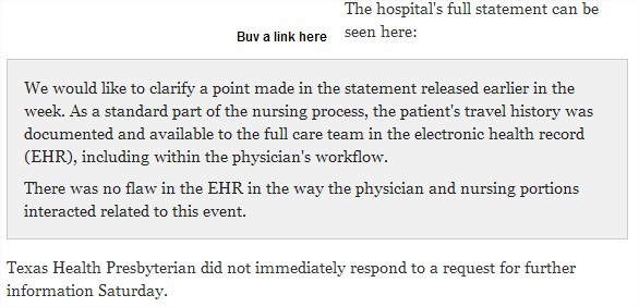
The content is about the statement and some other follow-up feedback from the hospital. It also includes the full statement in the story. Following the statement is the latest update of the hospital’s response, which is basically what the readers want to know after the story.

Dallas Hospital Backpedals On Reason For Releasing Ebola Patient - Google Chrome_3

Photo from Huffington Post

After the story, there is a brief update as followed. The update is a symbol of the news website to have a quick response to where the story goes to after the publication, comparing to the print newspaper.

Dallas Hospital Backpedals On Reason For Releasing Ebola Patient - Google Chrome_4

Photo from Huffington Post

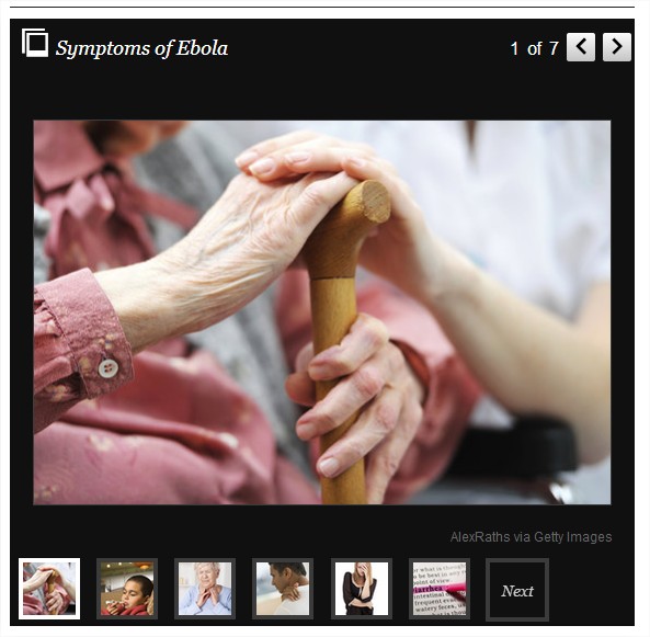
I’m always glad to see a photo gallery after a story to show some related and visual information about this topic, so at first, I thought this one as shown below was really about the symptoms of Ebola. However, we can easily tell that none of the seven pictures were from any Ebola related news. Those were just placed there as a symbol of the certain symptom. This makes me think that why they don’t just tell the readers what the seven symptoms are literally with some detailed description, instead of showing those unrelated pictures. Though the photo gallery could give the readers a direct image, it’s not true, and, at least for me, it has a side effect to reduce the news credibility.

Dallas Hospital Backpedals On Reason For Releasing Ebola Patient - Google Chrome_5

Photo from Huffington Post

Besides, the photo gallery, about the web design, the website still has a lot to do.

Dallas Officials Search For Man To Monitor Him For Signs Of Ebola - Google Chrome

Photo from Huffington Post

Following the title are the social media buttons with the real time figures of the likes and reposts. However, when people are rolling down the story, the page design becomes a little bit annoying. The social media buttons are now on the left column, still with the figures. But how important are those figures for people in the process of reading? I think, a better way is to keep the button away from the numbers, just as google+ and others underneath them.

Dallas Hospital Backpedals On Reason For Releasing Ebola Patient - Google Chrome_7

Photo from Huffington Post

Another thing which keeps interrupting the reading is the sponsored links embedded in the content. With similar but bold font and pictures, the links could easily draw the readers attention, which may be the intention of the sponsors and the advertisers. If just take the reading experience into account, the sponsor-link part should be differentiated from the content from the formatting perspective.

The last thing I want to “complain” about is the related news links. This is an issue about data mining, which enables the website’s database to find the most related news stories and show them to the readers. One of the best examples in this field may be the Amazon’s “Related to Items You’ve Viewed” function. Here, the problem may be not that complex, but it should at least be about how to classify the news, and how to build more reasonable categories in the database to search for the stories.

First three of the six related pieces are about Ebola, and the last three are totally healthy living ones. A tricky thing here is that though Ebola is a healthy living topic, it may not be the reason why people clicked the story link. This is a much broader topic now. So maybe we could try to mark it as “international issue” or “national news” to give the searcher a larger range to find a more proper list of what the readers may be interested in next.

Dallas Officials Search For Man To Monitor Him For Signs Of Ebola - Google Chrome_3

Photo from Huffington Post

Newbury Art Story

My News Diet

For me as an international student, the very first name that comes to me is the New York Times. The reason is quite simple–that’s the most famous one in the State. Among all the Chinese news outlets or website, I like the Chinese version Quora, called Zhihu. Though that’s basically a platform to share knowledge and answer all kinds of questions, many of the most popular topics are closely related to the latest news. And I like it mainly because it offers comprehensive information, opinions and knowledge to me. I check it almost everyday.

I also see Twitter, Yahoo Digest, and Circa as my top choices. I don’t try to avoid the selected news, such as Yahoo Digest, because that’s the most efficient way for me to learn what has happened today, and if I’m interested in some of the topics, they also provide the related links.

I always prefer the news with a strong background information, or at least the links to related background things. Because without this, the news may lose much of its value in my eyes. The context is important.

About the filter bubbles, honestly, I think it’s natural for the search engine to develop in this direction since they need to meet the users’ requirement as soon as possible. To find the thing they want, it’s done. And most of the people, personally speaking, also enjoy the process to find someone thinking in the similar way or sharing many things in common with themselves. It’s the human nature. To look for the disagreement needs courage. However, to learn something beyond one’s field or interest, that’s the essential step to develop and to know the world in a better way.

In a big image, some news media in China are doing in-depth reporting. But what I really want them to make more efforts on is that to market themselves better, and to draw the public attention to the accurate stories.

Aggressive readers, I think, are also a symbol of the digital age. Anonymous comments, quick feedback, extremely low possibility to pay for the offensive words or fake information. People are much more free, but maybe less open to different opinions, since they have no time to think about their words and others’ opinions before they push the post button.

How Has HuffPo Been Changing over Years?

This week, I want to use the Wayback Machine to track how the HuffPo’s page design has changed since the very beginning which May 9th, 2005, to recent version.

First, let’s take a look at the very first page of this news website.

The Huffington Post  The Front Page - Google Chrome

Picture from the Wayback Machine

So comparing to the recent version, the first one is much more like a news blog, which has a welcome post from Arianna Huffington who is the chair, president, and editor-in-chief of the Huffington Post Media Group. And then, it was almost divided fifty-fifty into the blog part and the news part. No need to say the simple but not very beautiful UI.

In the news part, we can see that as a news blog whose readers may have less time to finish the whole story, there are some red words called “in brief” which allows readers to take a glance at every piece in a short time.

The Huffington Post  The News Wire - Google Chrome

Picture from Wayback Machine

Same as the recent version, it has the email subscription function since the very first day. There is also an RSS/XML button on the front page.

The Huffington Post  The Front Page - Google Chrome_2

Picture from Wayback Machine

There is also a “Eat the Press with Harry Shearer” column, which is some thoughts about the press. No assigned topic, just to express some ideas in the relatively short piece (sometimes three or four paragraphs, or just one or two).

There is another thing which I think is interesting, that is, in 2005’s version, there is no FB, twitter, or Google+ follow button at all. The year when FB was founded may give a reasonable answer to this puzzle, 2004. I think that is also a typical symbol of the digital age that everything happens and changes so fast that you can not even remember what it was like five or ten years ago.

Now let’s click the button to view the 2008’s version.

Breaking News and Opinion on The Huffington Post - Google Chrome

Picture from Wayback Machine

A very important difference from the 2005’s is that the column navigation appeared! It means that the media has grown up to cover a stable number of stories in various fields. Besides, it has the rolling news to update the latest things.

The website changed it definition from “Delivering News and Opinions Since May 9, 2005” to “The Internet Newspaper: News Blogs Video Community”, and it also allows the readers to sign up, which can lead to a customized news outlets, and to search specific information in the very website or in the whole Internet. To be a more professional news website or news blog, it can be noticed that the whole page left more room for the news and less for the blog posts.

With the column navigation, ahead every story’s title is a tag with different color. More serious news such as Politics is blue, and more soft stories such as Media is orange.

New Post — WordPress.com - Google Chrome

Picture from Wayback Machine

But still no button to follow the FB or other social media accounts.

When it comes to Sep. 15, 2014, you can see the improvement of a news website born in the digital age over years. Access to different editions, to different versions of app, and to columns from politics to gay voices, even to the live news. They provides every possible way for you to follow them, to develop your dependence to the news outlets, and to make you feel that you can get almost everything you want on this platform.

Breaking News and Opinion on The Huffington Post - Google Chrome_2

Picture from Huffington Post

Why Huffington Post?

Breaking News and Opinion on The Huffington Post - Google Chrome

Picture from the Huffington Post

The reason why I choose Huffington Post is that I want to figure out why a blog could become such an influential news websites with so many contributors from different fields.

Breaking News and Opinion on The Huffington Post - Google Chrome_2

Picture from the Huffington Post

The first thing about the website is the pictures. Comparing to the traditional news website, such as the New York Times and the Washington Post, there are much more pictures on the home page of HuffPo, which can easily attract the readers and help them find the stories they want to read in a short time. Besides, it’s also easier to keep readers on this website when the content jumps between pictures and words.

Breaking News and Opinion on The Huffington Post - Google Chrome_3

Picture from the Huffington Post

Second, as a typical news website combined with the social media, it puts the FB, twitter, and google + follow button with the number of followers just beneath the site’s name. It makes the following decision much easier with fewer steps. And then when we go down, it comes to the email subscription part, after you enter your email address and click “subscribe”, a new window would jump out and ask you what specific sections do you want the newsletter include. With two steps, the newsletter would be customized. So the readership could grow efficiently.

Comparing to some traditional news websites, the stories on the HuffPo are shorter. And it has a larger percentage of stories about lifestyle, food, entertainment, and so on. All different kinds of stories are shown on one page, this may be a useful way for readers to find something new.

Electronic Skin Made From Nanoparticles Offers Early Breast Cancer Detection - IEEE Spectrum - Google Chrome

Picture from IEEE Spectrum

When readers go to the page of a story, it has nothing much different from other news website, also words combined with pictures and videos. But that reminds me of the NYT and a science news website called IEEE Spectrum. Both of them provide the links to related stories and former reports on one side of the page. NYT has smaller titles with links while IEEE Spectrum shows bigger ones and the pictures. Since IEEE Spectrum focuses specifically on technology, engineering, and science news, their readers may need some background knowledge about the news or some related information in case they want to dig deeper. But for the HuffPo, from my perspective, it would also be a good idea to show things like those on the page while people are reading.

As a result, the HuffPo has a simple-style and user-friendly page which allows readers to get what they want really quickly and sometimes with a bonus. Maybe because it was founded as a blog in the very beginning, its target reader group seems not to be the same as those who love NYT or Washington Post, and it would cover some stories in different fields.